Youtube Travel Guides
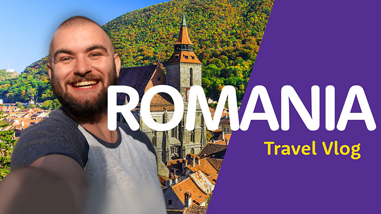
Opening title sequence
The opening graphics are kept minimal to portray a stylish cinematic effect within the widescreen footage.
Shots are specially selected to have the most impact and ensure legibility.


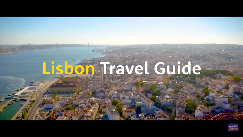
Main section title screens
Prominent bold graphics are used to separate and identify each section.


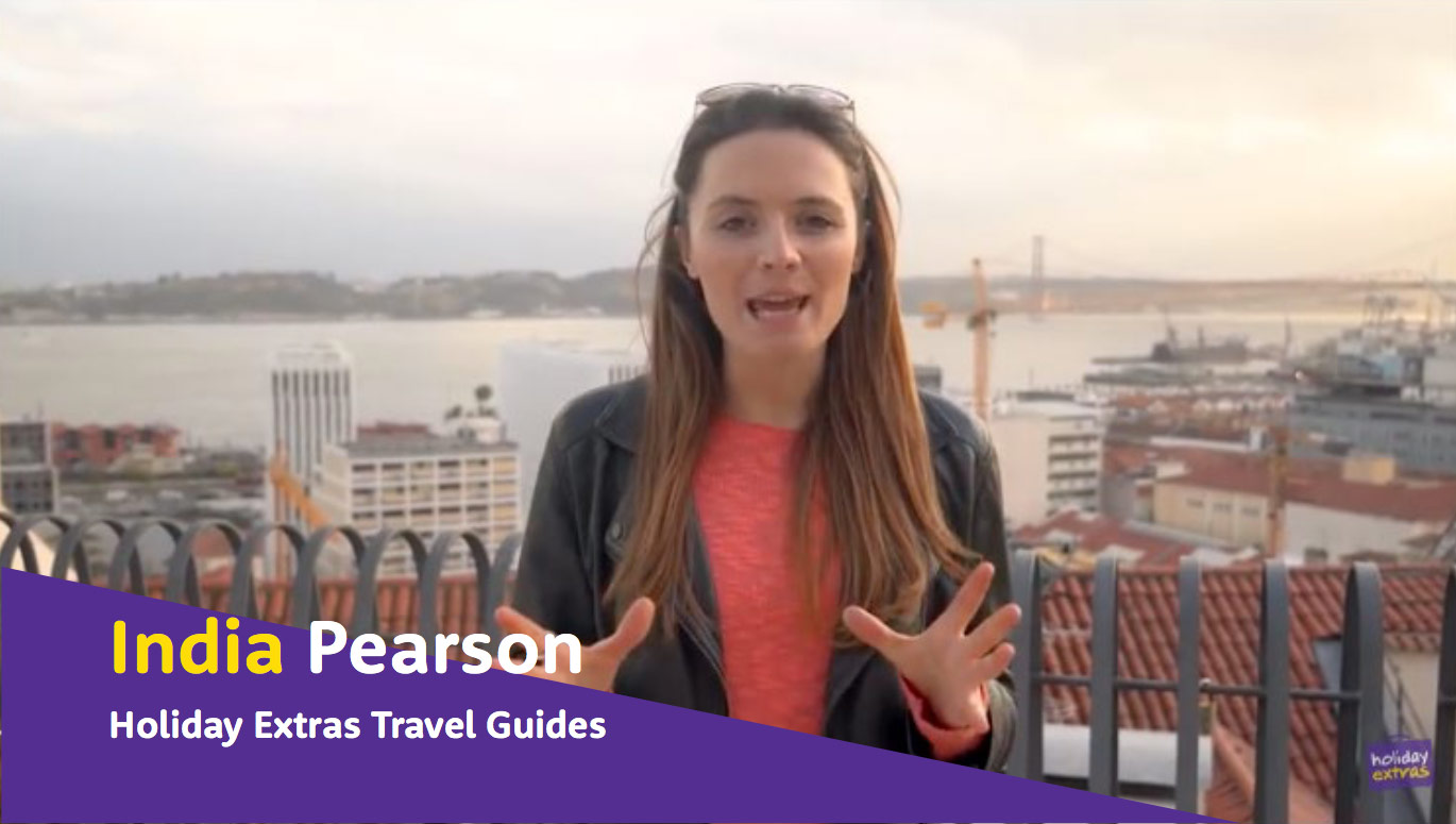
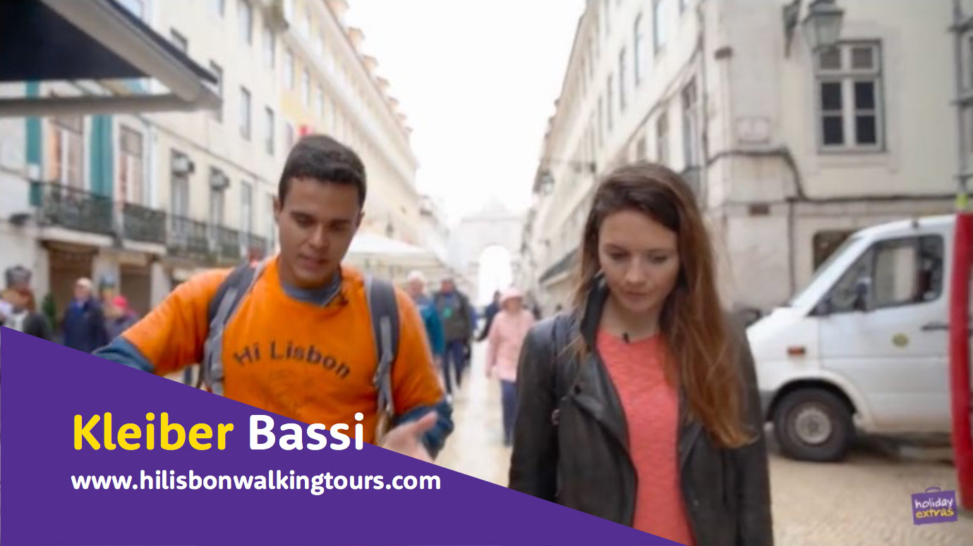
Name captions
A person’s name is always consistently placed in the bottom left using the format of large name on the first line, followed by smaller description on the second line.
The purple panel may appear just in the corner if text content is short as per these examples here.
Information panels
Text sizes will vary upon content and importance.

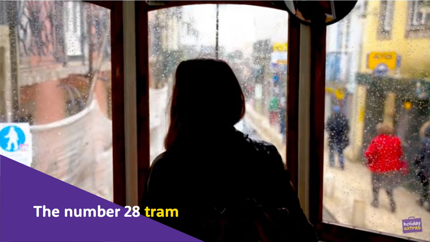
Location captions
Previous location captions didn’t need colour behind them for legibility as they were displayed for such a long time.
They appeared large to start, before shrinking small into the corner. Instead of this large to small text animation, we will have the text at a single size, with the purple panel animating on for a short time to allow for initial legibility. The purple area can then drift off leaving just the text.
This also means that we no longer need to display it large at the start, as it will already be legible to begin with.


Translations
Translation captions have been redesigned to ensure good legibility.

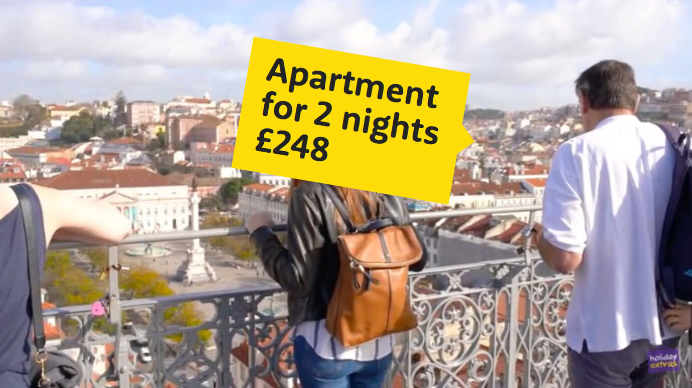
Price labels
Arrow bubbles can be placed at fun angles to match the relevant item.
Yellow colour references supermarket price stickers and provide variety against the other mainly purple graphics.


Advertisement
Redesigned advertisement section.